My colleagues and I have been working on a new website, www.artospherefestival.org. It’s a pretty site, full of fun events and information about a very cool upcoming Arts and Nature festival. You should check it out.
Anyway, it was with some trepidation that I showed it to a large group at work and braced for the storm of feedback that I knew would come. And come it did. I don’t care how prepared you are, when people start picking apart something you’ve worked your ass off to create, it’s hard.
And if you’ve been working on websites for years, there’s one phrase that will make your head explode. It’s this:
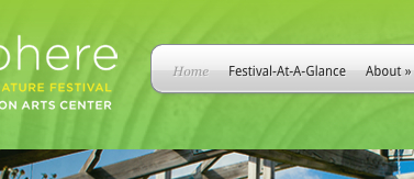
Where’s the HOME button?
I could hear our web designers’ eye roll from two buildings away. I mean really, does anyone not know that you click on the logo up at the top to get to the homepage?
Apparently, yes.
Here’s the thing about this particular bit of feedback. It’s really not hard to add a “home” button to a website. It couldn’t be simpler. But somehow, it just makes all of us who work on websites crazy. We don’t want to HAVE TO. We can’t really understand why everyone doesn’t feel the same way.
It’s the same with all technology, I guess. Or with all change. Even if the world pushes ahead, everyone doesn’t come along at the same pace. And those of us who are charging forth need to remember that sometimes progress for progress’ sake doesn’t resonate. I think this is a good lesson for the modern worker; don’t let the gap between old school and new wave get too wide. Because eventually you’ll have to add the home button anyway.